Category: Branding & Design
Typography might seem like a small detail, but the fonts you choose have a powerful impact on how people perceive your brand. The right typography communicates your personality, establishes credibility, and makes your content a pleasure to read. The wrong fonts can undermine your message before anyone reads a single word.
At Extatic Design, typography is a crucial part of every brand identity we create. Let's explore the fundamentals of choosing and using fonts that strengthen your brand and improve your communication.
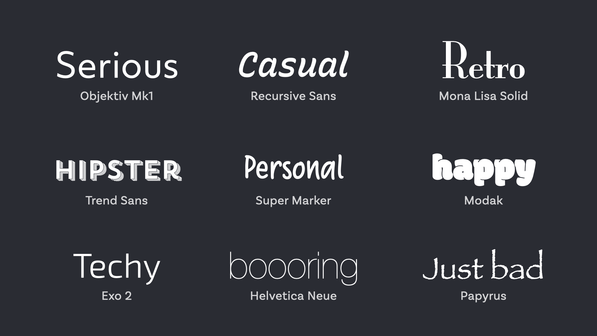
Before selecting fonts, it helps to understand the main categories and what each communicates.
Serif Fonts: These fonts have small decorative strokes (serifs) at the ends of letters. Think Times New Roman or Georgia. Serifs convey tradition, authority, and sophistication. They're popular with law firms, financial institutions, and luxury brands.
Sans-Serif Fonts: These fonts lack the decorative strokes, creating a cleaner, more modern look. Arial, Helvetica, and Open Sans are common examples. Sans-serifs feel contemporary, straightforward, and approachable. Tech companies and modern brands often favor them.
Script Fonts: These mimic handwriting or calligraphy and convey elegance, creativity, or personal touch. They work well for logos and accents but should be used sparingly since they're harder to read in body text.
Display Fonts: These are decorative fonts designed to grab attention in headlines or logos. They have strong personalities but are typically not suitable for body text.
Your typography should reflect your brand's personality and resonate with your target audience. A children's toy company would choose very different fonts than an investment bank.
Consider what qualities you want your brand to communicate. Professional and trustworthy? Traditional serifs work well. Modern and innovative? Clean sans-serifs are your friends. Creative and playful? You have more room for expressive typography. Whatever you choose, make sure it aligns with your overall brand identity and appeals to the people you're trying to reach.
No matter how beautiful a font looks, if people can't read it easily, it's not doing its job. Readability should be your primary concern, especially for body text and important information.
According to Nielsen Norman Group, poor typography is one of the most common usability mistakes on websites. Choose fonts with clear letterforms that remain legible at various sizes. Avoid overly thin or decorative fonts for body text. Test your typography on different devices and screen sizes to ensure it works everywhere.
Most designs use more than one font, typically one for headings and another for body text. Pairing fonts effectively creates visual interest while maintaining harmony.
Create Contrast: Pair fonts that are clearly different from each other. A serif heading with a sans-serif body creates pleasing contrast. Two similar fonts can look like a mistake rather than a deliberate choice.
Maintain Harmony: While fonts should contrast, they should also complement each other. Look for fonts with similar proportions or mood. Fonts from the same designer or type family often pair well.
Limit Your Selection: Stick to two or three fonts maximum. Too many fonts create visual chaos and weaken your brand identity. One font for headings and one for body text is often sufficient.
Beyond font selection, several technical details affect how your typography performs.
Font Size: Body text should typically be at least 16 pixels on screens. Headings should be noticeably larger to create clear hierarchy. Consider your audience; older readers may need larger text.
Line Height: The space between lines of text affects readability significantly. A line height of 1.5 to 1.7 times the font size is generally comfortable for body text.
Line Length: Lines that are too long or too short are difficult to read. Aim for 50 to 75 characters per line for optimal readability.
Letter Spacing: Adjusting the space between letters can improve readability and create different effects. Headings often benefit from slightly tighter spacing, while all-caps text usually needs more space.
When using custom fonts on websites, consider how they affect page loading speed. Web fonts require downloading additional files, which can slow your site if not handled properly.
Use services like Google Fonts or Adobe Fonts that are optimized for web delivery. Limit the number of font weights and styles you load. Only include the character sets you actually need. Implement font loading strategies that prevent text from being invisible while fonts download.
Your typography choices should be consistent across all brand touchpoints, from your website to business cards to social media graphics. This consistency reinforces brand recognition and professionalism.
Document your typography choices in brand guidelines that specify which fonts to use, when to use them, and how to apply them correctly. This ensures everyone who creates content for your brand maintains typographic consistency.
Watch out for these common pitfalls: using too many different fonts, choosing style over readability, ignoring hierarchy, using decorative fonts for body text, and failing to test typography on different devices. These mistakes can undermine even the most thoughtful font selections.
Great typography is an investment in your brand's perception and effectiveness. The right fonts communicate your personality, improve readability, and create a more professional appearance that builds trust with your audience.
Want typography that enhances your brand? At Extatic Design, we select and implement fonts that strengthen your brand identity and improve your communication. Contact us today to discuss your branding needs. Our designers will help you choose typography that looks beautiful, works across all platforms, and truly represents who you are. Let's give your brand the typographic treatment it deserves!